I needed a logo with a real identity
La Petite Trotteuse is my favorite hobby.
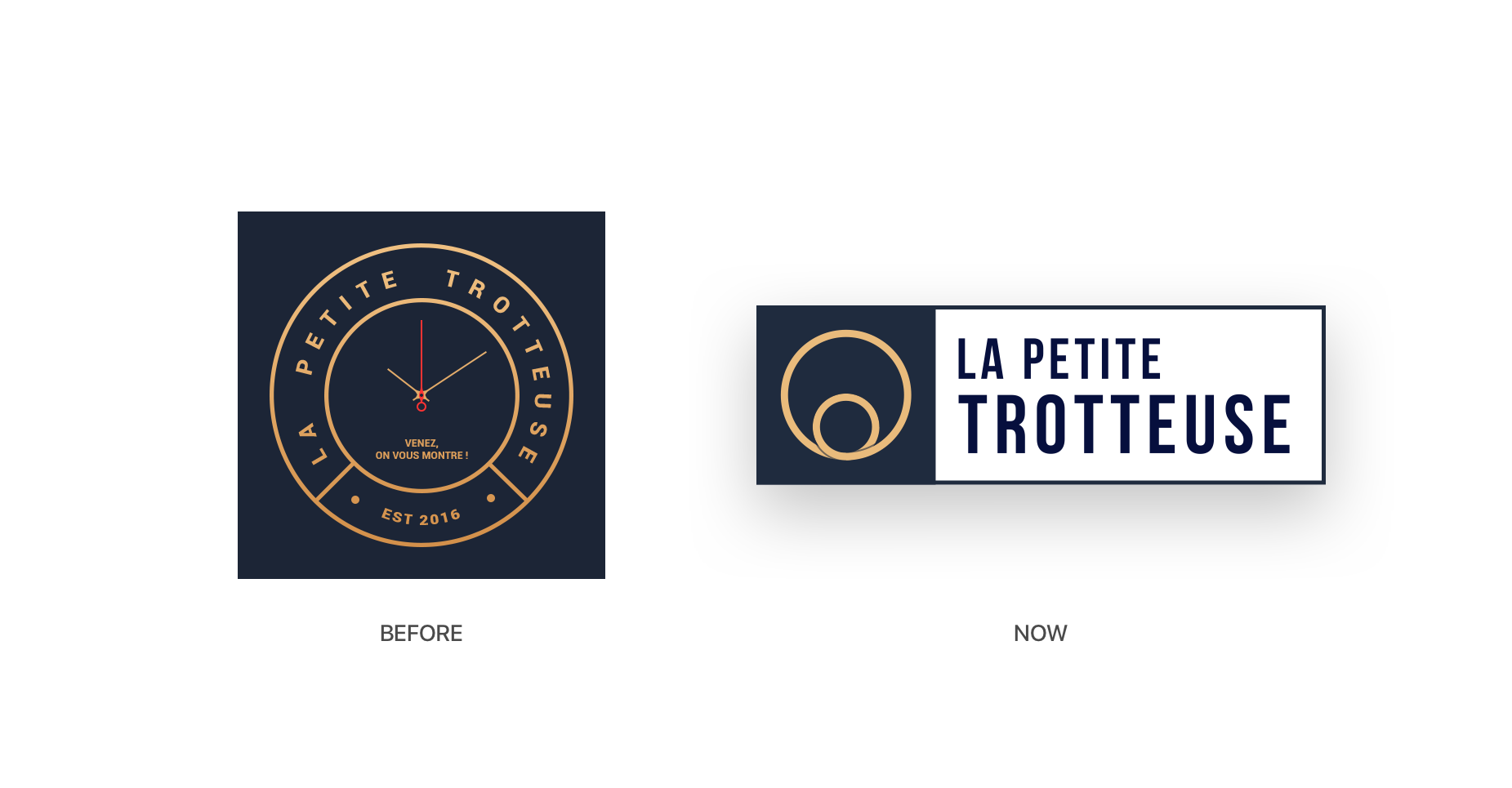
I launched the website on January 2015. I used the first graphic identity for a year but then noticed that something was wrong, It didn’t fit the project’s spirit anymore. It was too much complicated and did not matched with the new layout of the website. This is why I redesigned the logo, to something smaller, simpler, and really more powerful.
Simple but efficient design
With two concentric circles, the logo reminds the shape of watch dials. It's also a tribute to the Galileo Galilei solar system, and the iconic circle shape of a watch. I didn’t want to make a complex logo, but something convenient and significant, I can easily use either in small sizes (favicon, shortcut...) or large images.
See it in real
Design for better communication
It's really much more easy to communicate with this logo. Use it in small or large size, it's always good.